
./melkweg
../real estate project
../category
UX/UI/branding/
photography/videography/
editing
../client
Catherine & Jurgen
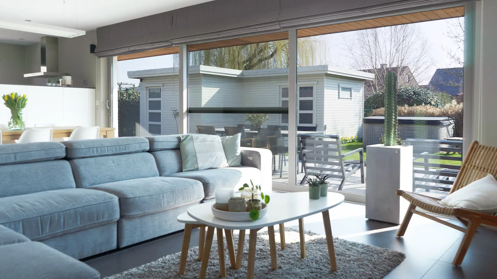
In order to sell the house of my parents,
I was asked to take real estate photography and videography as well as a website to attract potential buyers. While
the initial asking price was 399.000 euro's, we managed to
sell the house for 30.000 euro's above asking price in
just a couple of weeks.
../defining the problem
During the COVID-19 pandemic, in winter,
my parents came up to me and asked me if I could
help them sell their house using my experience
in photography, videography, webbuilding and design.
This wasn't a straightforward task however.
I had a very tight deadline to work with to do
photography, make a video, edit everything
and on top of that build a website.
On top of that, it was still winter.
Real estate projects are usually done during
the warmer seasons for better pictures,
but I didn't have that luxury.
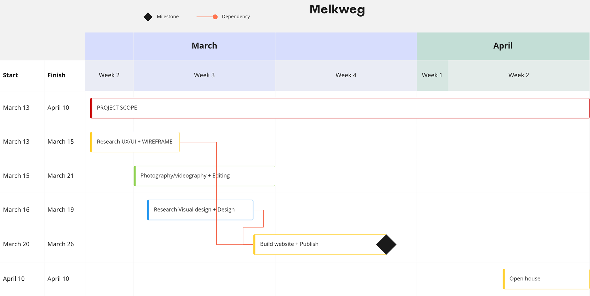
With my limited time window, I decided
to plan what I would do when and calculate how
much time I'd need to spend on each task.
This allows me to focus better and also helps me
pinpoint which areas are more important and
which tasks I can potentially spend less time on.
Building the website would take me
the longest time, but photography and video were
equally important to sell the house. This
meant that I had less time to spend on the "branding"
of the website, which wasn't so bad since
there really wasn't any need for a deeply thought
out identity system. On top of that, I decided
to look at competing real estate agencies in the
area and found that their websites weren't
very experienced when it comes to visual design,
allowing me to focus on other areas.
../finding the solution
Now that I had a schedule to work with,
it was time to get to work. Since the weather
didn't allow for photography yet, I started
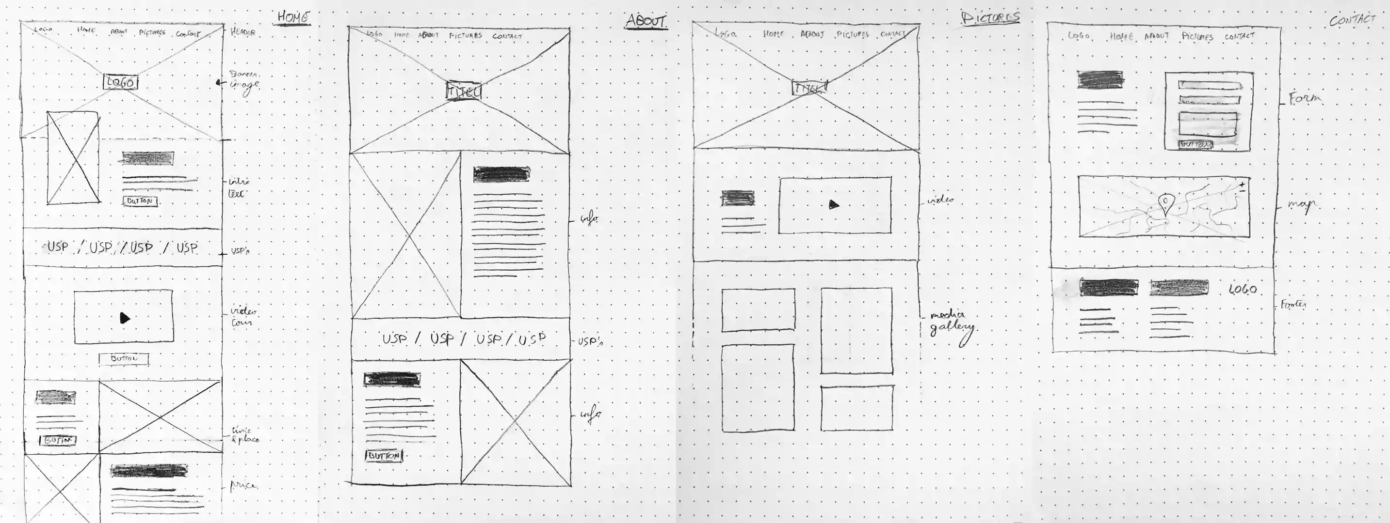
out by creating a wireframe for the website.
I based my wireframe on the websites I scouted
from my competitors. While their visual design
wasn't the strongest, they are deemed some
of the best in the business. This meant that they
know how to sell houses with their websites,
which means a good starting point for my own.
The wireframe is based on a wordpress theme.
I decided to go this route since it's faster and
sufficient for the goals I have with this project,
especially given the deadline to publish.
A common thread among all the websites
I studied, was which information was given and
in which order. First there is a brief summary of the house to get people interested for more.
Next there are some USP's such as the size,
amount of bedrooms, energy labels and so on. After
that you provide the viewer with a date for the
open house and last but not least, the kick-off price.
When it comes to pages other than the homepage,
I opted for an extended "about the house" page,
a picture gallery and a contact page for people
to schedule their visits. We had to schedule
timeslots for the open house as we were in the
middle of a pandemic.
target audience
Seeing how the neighbourhood is mostly
couples in their early 30's with children, I decided
to keep the design appealing to a young adult
audience. Prefererably couples in their late twenties
who wish to live in a safe neighbourhood, where
their future children can play on the street with other children.
Visual design
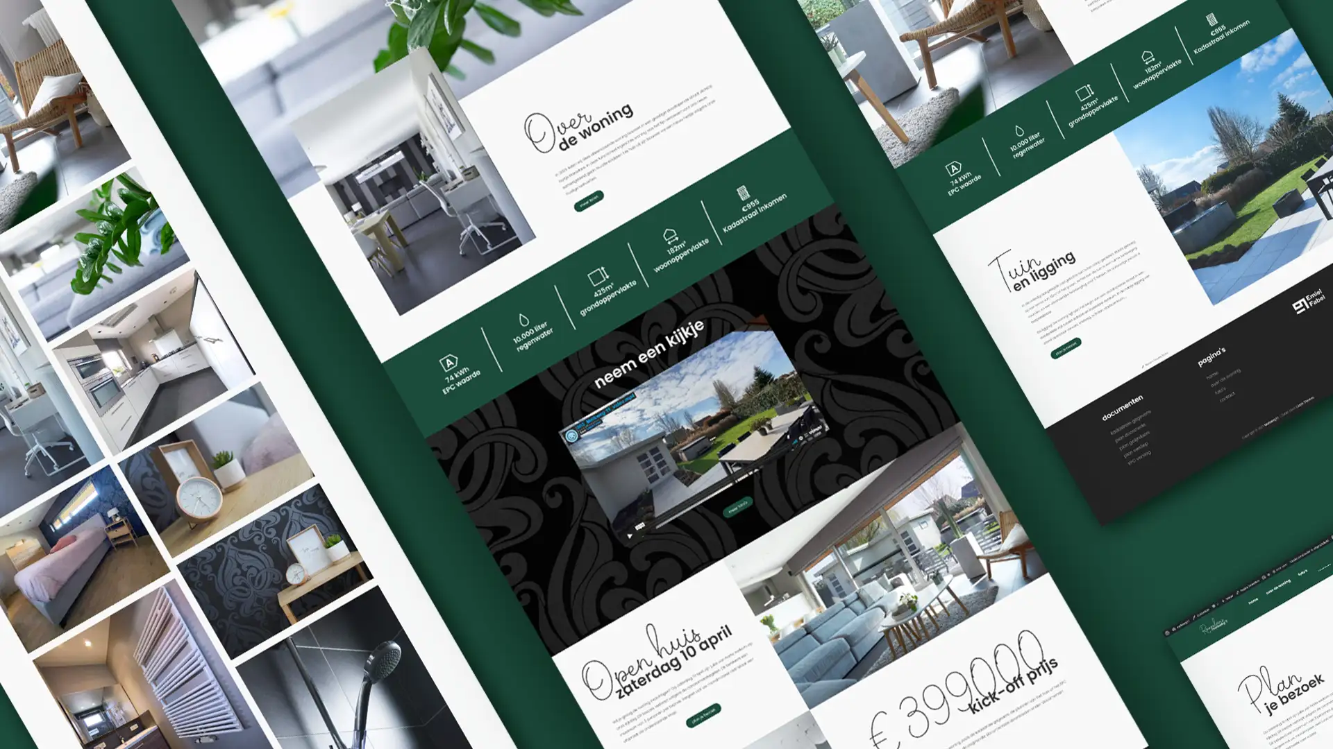
For the visual identity, I decided to work
with the dominant colors of the house and reflect
them on the website. This way I could ensure
that the website gives off the overall feeling
of the house. Not only that, but it also helps
tie the pictures together with the website to
form a cohesive unit. Aside from the colors,
I also used the patterns of the bedroom wallpaper
as a black background in certain areas, really
turning the website into a digital version of the house.
font
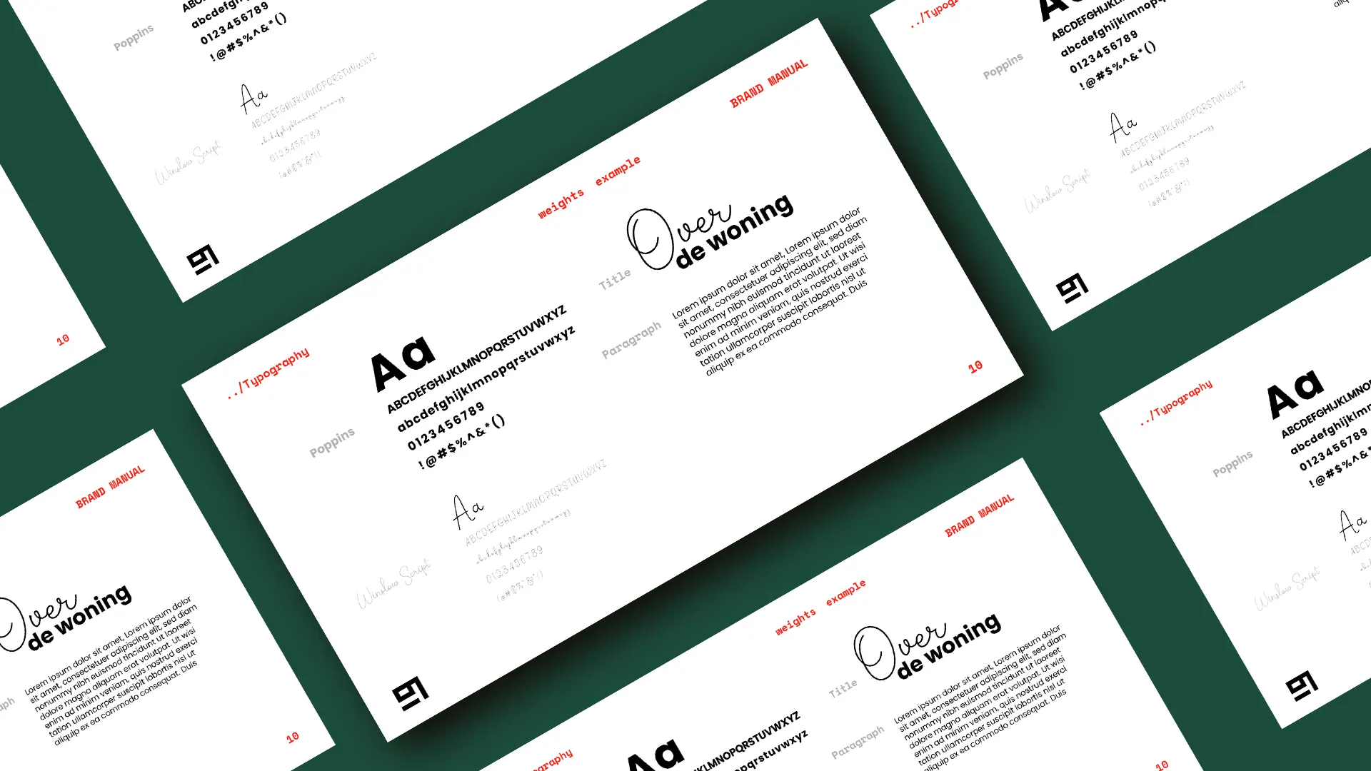
To tie the entire website together,
I had to make sure the font choice was fitting
for the target audience. To do so I did some
research on what's popular among people in their
late 20's by scouting social media.
One thing that I kept seeing was this mixture
of handwritten typefaces with sans-serif typefaces.
In fact, there were several frames inside the
house with this exact style. Since it's not only
popular among the target audience, but also
present inside the house, it seemed fitting to use
this style as it would further cement the idea
of translating the style of the house into a
website while still targeting the right people.
../conclusion
The final website turned out to be a great
success. Without the help from a real estate
agent, we received 30+ mails from people who
were interested. Since we received an overwhelming
amount of responses, we had to extend the open
house an extra day. In the end we received 28 families,
12 of which ended up making an offer.
In the end we managed to sell the house for
429.000 euro's, a 30.000 euro increase from the
original kick-off price of 399.000 euro's.
While the end result was a great success,
I would definitely do some things differently in
the future. Even though the time I had to work
on this project was out of my control, I would
definitely start a project like this much earlier
than when I was approached.
I was able to accomplish plenty in the time
I was given, but essentially didn't have much room
for error as everything had to go quickly.
In the end I conclude that this project was a
great success as I was able to get the house
sold above asking price while learning more about
the importance of scheduling for myself.