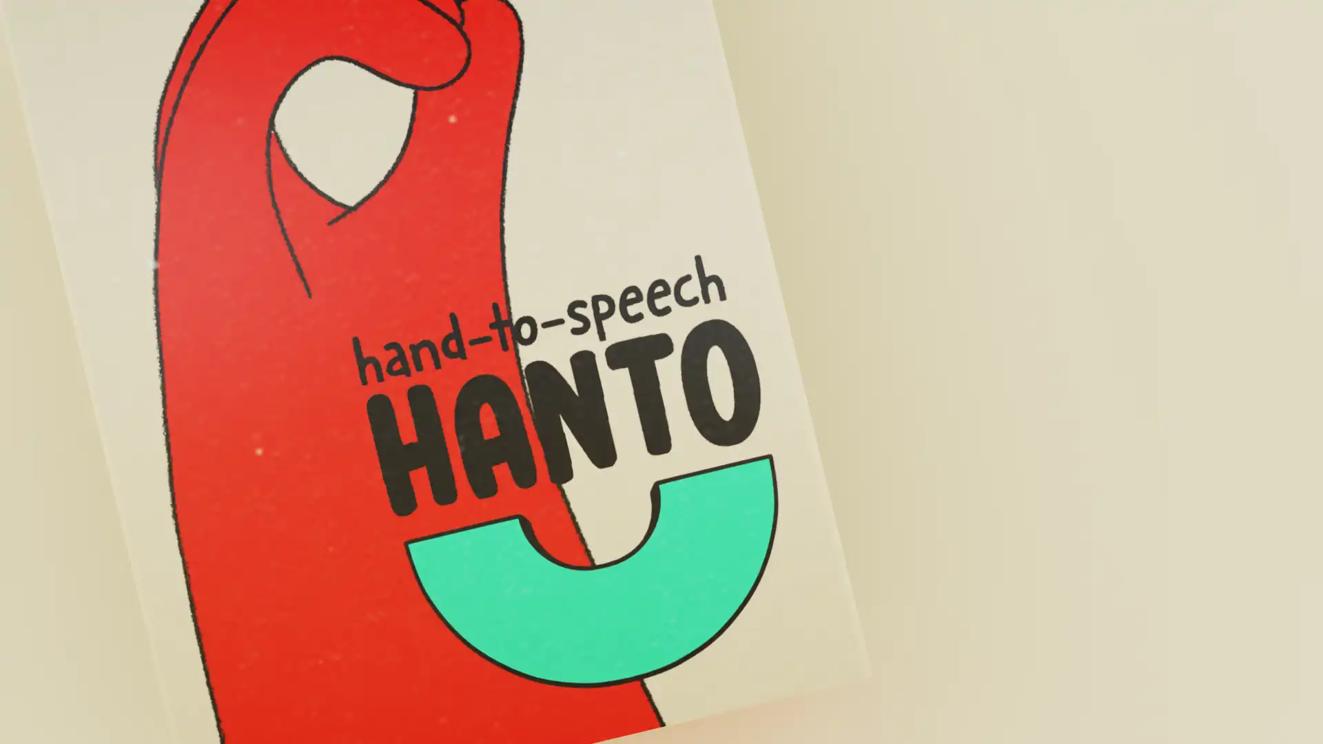
./hanto
../hand-to-speech
../category
animation//product design//UX design//UI design//3D modelling
../client
HSRW bachelor thesis
Based on the concepts of “Google Glass”, “Meta Quest 2”
and research on the use of deep learning to translate dynamic
sign language, the aim is to design a concept for a device
that can read and translate sign language in real time in order to bridge the gap between people who are deaf/mute
and people who do not understand sign language. By combining existing technology into a single purpose device, making
the daily lives of deaf/mute people easier. Not only that, but communicating with people no longer require the need to learn sign or require an interpreter to communicate with deaf people as the device makes use of speech recognition to relay what’s being said on to a display in the form of text.
../defining the problem
Based on research done by the World Health
Organization, there are around 466 million people
in the world with disabling hearing loss. By 2050
this number is expected to go up to 900 million.
In order to help these people with communication, sign language was developed. Instead of having onestandard global sign language however, we have several different varieties such as American Sign Language, British Sign Language, African Sign Language, Chinese Sign Language, Portuguese Sign Language, Korean Sign Language, Arabic Sign Language, and so on.
In fact, according to k-international there are
somewhere between 138 and 300 different types of sign
language. To add to the problem, based on statistics
in an article from newsweek, roughly 98% of deaf
people in the United States of America do not receive
educationin sign language.
Based on all these problems,it becomes clear quite
fast that people who are deaf are at a huge disadvantage
when it comes to communicating on a daily basis.
Not only do they themselves require to learn a sign language, the people they communicate with would also have to know sign language and the exact same one at that. If there were to be a device that could detect sign language and turn it into speech, it would provide a solution to both those problems and provide new chances for deaf and mute people.
My interest in the topic of sign language began
in 2020 when I stumbled upon a YouTube video titled “Deaf Man vs. Drive Thru: They Threw Away My Food!”
by Sign Duo. In the video, a 100% deaf person and his girlfriend show us how a simple and mundane
task like ordering food at a Drive Thru can turn into a real nightmare for someone who can’t speak.
Not only do the people working there not take him serious, even going as far as to say he’s faking it.
One of the staff members even claims they tossed
away the order initially, which is why it ended up taking over 20 minutes for him and his girlfriend
to receive their order, which ended up being wrong as well.
In the video,the man claims that this happens all too often still to many people in the deaf community. This was a really eye-opening video for me and got me more interested in deaf people and sign language.
That year was also the year where the global
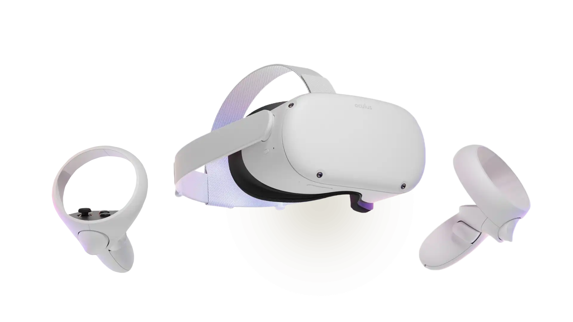
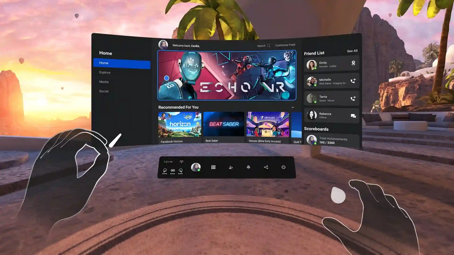
COVID-19 pandemic hit and caused everyone in the world to stay inside for over a year. Due to the lack of social contact during the lock down, I decided to buy a virtual reality headset. I purchased the Oculus Quest
2, a VR headset that can be used wirelessly compared
to other headsets that require a PC-connection. What makes this device even more unique over its competitors is the ability to detect your hands and fingers using the 4 small cameras attached to the front of the device, allowing you to have full control over your hands and fingers inside the virtual reality space.
Surprisingly, this is also the cheapest headset on
the market. It only cost €300 retail price at the time of writing, making hand tracking incredibly consumer friendly. With my new headset I decided to socialize in a game called “VR Chat”, a social game that lets
you be any character you want to be and allows you
to simply talk to people. To my surprise however, a
lot of people weren’t talking at all. Instead, they
were using their hands to communicate using a simplified version of American Sign Language that suited the limitations of virtual reality gesture accuracy. This sparked the idea of what would become “Hanto”
../finding the solution
VR Chat mute community
While there were a lot of players not talking,
most of these people were not actually deaf or mute,
as they were perfectly capable of understanding other people. As it turns out, a lot of people simply prefer not to speak in an online gaming environment.
Social anxiety, hiding your gender, hiding your age, not being good at English. All of these are reasons why people decide to mute their microphone, which is why they got the name “mutes”. However, just because they are hiding their voice doesn’t mean they don’t want to talk to other people. Because of this, people started teaching sign language courses inside VR Chat to help people communicate inside the game
that would prefer to not use their voice.
As mentioned before, it turns out that this version of American Sign Language is a version adapted to the limitations of virtual reality. While real world ASL uses facial expressions combined with hand signs to emphasizecertain words and emotions, virtual reality
currently does not have the capability to track faces.
On top of that, virtual reality tracking can
be a bit wonky compared to the accuracy of real world
signs, which is why the simplified version was created.
Something which would become very important to the existence of Hanto.
Leap Motion
After being so impressed with the hand tracking technology of the Oculus Quest 2, I decided to do some research to see if there was anything else like it on the market. As it turns out there was, and it’s closely related to the virtual reality world I had just visited.
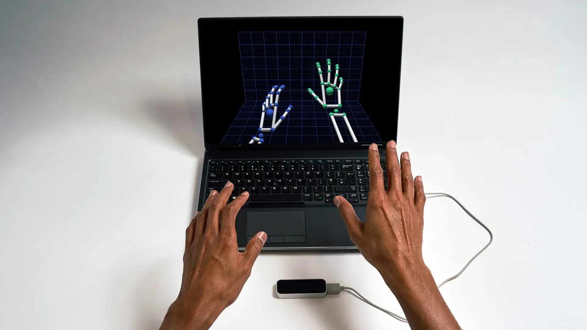
In 2012, a product named the “Leap Motion Controller”
was released. The device is compact in size and allows for complete hand and finger tracking using sensors similar to the ones found in the Oculus Quest 2. Since it does not contain an actual processing unit, you are required to connect it to a computer using a USB cable. By doing so, you are able to essentially use your hands as a mouse cursor to grab and move around windows.
You can even perform gestures to lower the volume
among other things. So how did I learn about this device?
As it turns out, the mute community of VR Chat heavily
utilized this product before the Oculus Quest 2 was
released. By attaching it to their shirt with a clip, they were able to track their hands similar to how they
can with the Quest 2. This method is also used by “V-Tubers”, which stands for Virtual YouTubers.
Basically, people who are too shy to show themselves
on YouTube use this device to animate a virtual character, allowing them to still have a connection with their
audience. This device and the way people attached it
to their shirts became my inspiration behind Hanto.
I wanted to have a device that could offer accurate hand
tracking by wearing it as a piece of jewelry. Compact,
accurate and easy to use so that it would be beneficial
for deaf people to use without it feeling like a chore to carry around.
Other solutions
Now that I head the idea in mind of what Hanto
should become, I made sure that nothing else was already being produced by other people to assist in the
communication of deaf and mute people. During my research I found that researchers where developing gloves which
had wires and sensors attached to them, allowing accurate measurement of how individual parts of the finger moved.
In fact, the VR Chat community on YouTube has made
similar devices and they do work. However, wearing gloves
the whole time seemed like a very limiting and irritating
experience if you had to wear them all day to communicate
with people. Not only that, but it would simply look weird
as well. With Hanto, I wanted to have a device that would
simply look like you’re wearing a piece of jewelry and
allows you to be hands-free.
In order to communicate with Hanto, the device would
have to not only recognize your sign language, but put that
sign language into sound, similar to how virtual assistants
understand us when we speak or how text-to-speech allows
for written text to be converted into sound. A study
called “Semantic Deep Learning to Translate Dynamic
Language” explains how AI technology is being used
to learn how to accurately read and understand sign language,
meaning that the technology for Hanto is possible.
Another technology that already exists
for a while and is making a comeback are smart glasses.
There are a wide variety of glasses with different
functions similar to how smart TV’s don’t necessarily
all perform the same. However, the most interesting
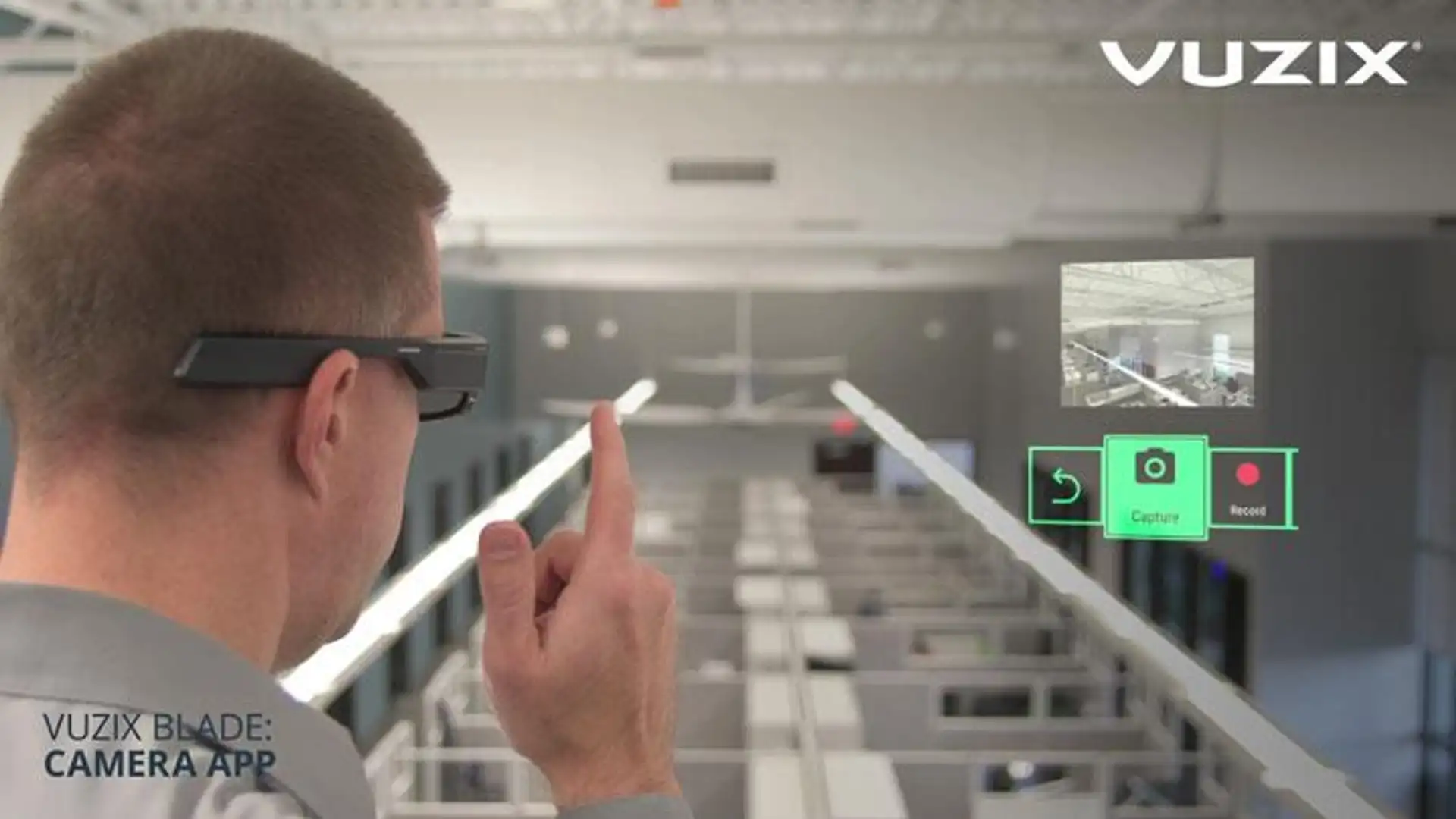
ones are glasses such as the ones from VUZIX
that use augmented reality technology to display
information in front of you without hindering your sight,
as well as being capable of connecting with Bluetooth
devices such as smartphones.
These glasses have a strong processor inside
that allows them to perform heavy tasks fast and easy.
At first my idea for Hanto was to develop smart glasses with the functionality to read sign such
as the VR headsets can, but that turned out to be a bad
idea since the market is already saturated with so many
glasses that nobody would want to buy another pair
specifically to read their sign language. So instead
I decided to focus on a separate device that can
utilize the Bluetooth functionality of these glasses
to pair with them, allowing people who own a pair of
smart glasses with the same functionality as VUZIX
to pair Hanto easily without needing to buy another
pair of expensive glasses.
I didn’t want Hanto to rely on the use of smart
glasses however, so instead it adds extra functionality
such as displaying your conversation in text for an
even better experience. Since a lot of deaf people can
read lips or understand the basic gestures of people
who can’t speak sign language, this extra feature of
reading what they are saying is considered non-essential
to the Hanto experience, but rather seen as a bonus
feature that allows for deeper conversations than simply ordering food.
../preparation process
Research about the deaf community
In order to further develop my project, I had
to get in touch with more people from the deaf community.
While I was unable to directly get into contact with
larger communities, I was in fact able to talk to a neighbor
who is deaf with the necessary help from his wife to
help interpret. I asked if similar to the Sign Duo video,
they experienced many issues in their daily life that
are supposed to be small and easy tasks. As a reaction
to the scenario in the video, he said that he doesn’t
even go to Drive Thru’s because the trouble is simply
not worth it despite the fact that Drive Thru’s were
made for convenience of people who can hear and speak.
Since he lives a routine lifestyle he mainly avoids
trouble since the people he communicates with are already
aware of him being deaf. When I asked him if a device
like Hanto would be interesting to him, he said it would
definitely make small nuisances like having to write
down everything go away.
I also made sure in my research to see what
the political correct terminology for deaf people is,
but as it turns out the overwhelming majority of people
prefer to be simply called deaf and mute. This was important
as I would essentially be making an animated infomercial
for my product and using the wrong words would definitely
be bad publicity for the brand and its marketing.
Naming
Now that I had an idea of what I wanted
the device to do, I started by thinking of some names
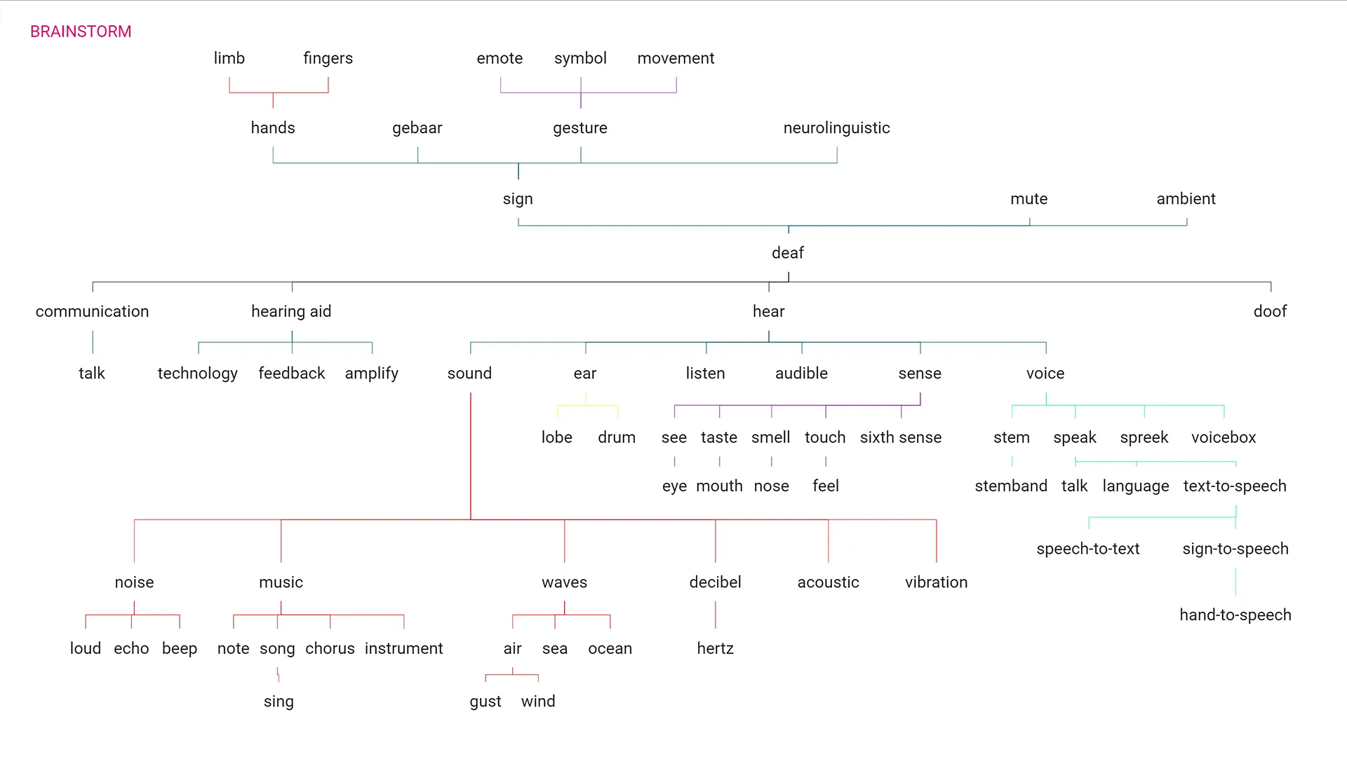
for the product. I made a type of mind map where
I summed up all the words that had something to do
with hearing, speaking, using your hands, etc.
I then subdivided these into more words that are
similar or have something to do with the topic.
While there were a lot of interesting options,
the final name should represent the functionality
of the product while also being catchy, short
and easy to carry over into a global market. I eventually
stumbled upon the term sign-to-speech, a play
on the term text-to-speech. However, I couldn’t
find anything interesting to do with it as
SINGTO sounds a bit difficult with the “NG” sound.
I changed it to hand-to-speech and from there
the name Hanto was born. At first I tried to play
around with the last letter of Hanto, spelling it
out phonetically or changing it to HANTU when I decided
that the device would be “U” shaped. I decided
against the idea later on as it distracted from
the simplicity of the existing idea behind the name
Hanto. It’s short, has easy characters to pronounce,
can be pronounced in different ways and it simply
sounds fun which is what it should be all about
when using this device.
Inspiration
Now that I had my name it was time to do some research
on existing styles. At first I looked at advertisement
campaigns of technological devices that could represent
the idea of what Hanto should be about. Essentially I wanted
to see what campaigns promote a better life when using
their product since I initially wanted Hanto to represent
opening a door to a whole new world that was previously
locked away by the limitations of being deaf.
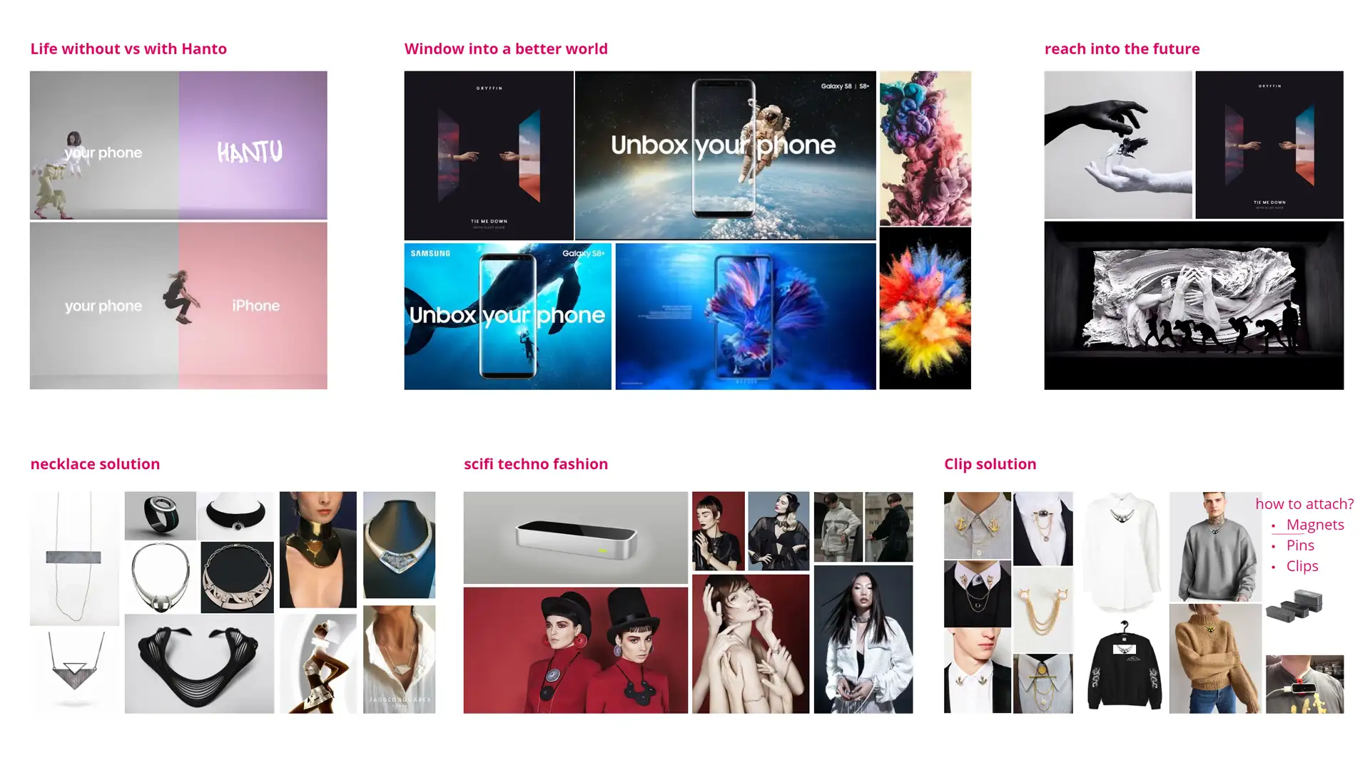
Apple in this case had a famous marketing strategy
where they compare life with your current phone compared to
the fun life you’d have with an iPhone. Samsung on the
other hand marketed themselves similar to the opening a new
door idea with their “unbox your phone” campaign.
I also played around with the idea of “reaching for a
new world” as Hanto is about using your hands after all.
While I didn’t carry over the message of reaching for a new
world, the prominent use of hands is still visible in the final outcome of the Hanto brand.
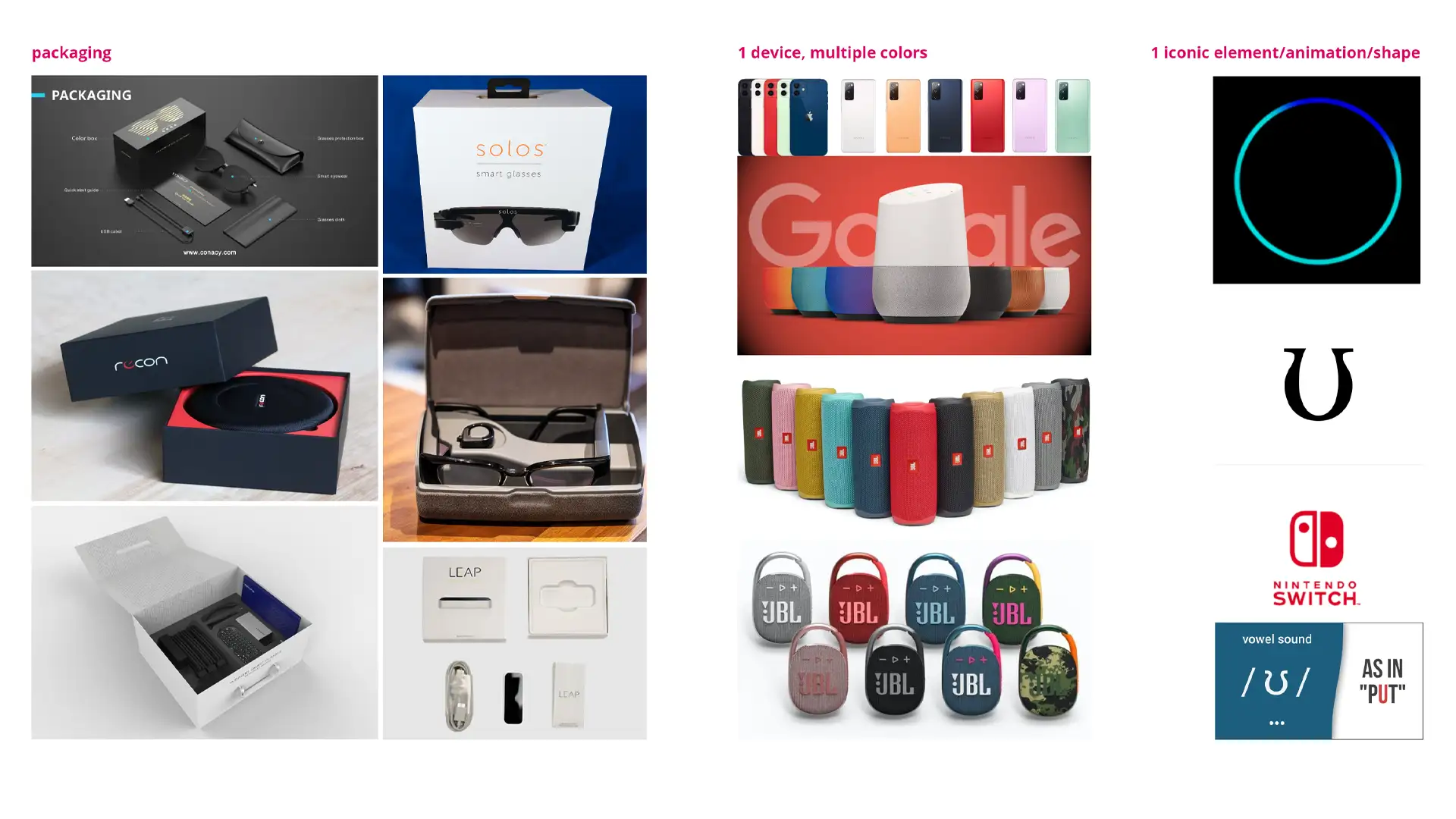
I also looked at what types of packaging similar
devices come in such as the leap motion controller, smart
glasses and so on. Most of the packaging was rather
uninspiring however and didn’t really enhance the product
or its brand in any way. It was only near the end of
the project that I would stumble upon a fitting packaging
style for Hanto.
As mentioned before, I wanted Hanto to be like
a necklace so that it would not obstruct people in their
daily lives, nor make them receive weird looks by the
people around them as being deaf can cause enough stress
as it is. I looked at some more futuristic designs of
chokers, necklaces and so on but realized that these would
only look good on women in fancy dresses and would
definitely not be suitable for casual attire nor for the
average male. My target audience was deaf people from
any age and gender, so I had to look for more neutral options.
That’s when I stumbled on the clipping jewelry, it would
release tension on the neck and be more gender neutral.
However, it wasn’t suitable for a wide variety of clothing
and ideally the device should be worn by anyone at any
time, from casual hangouts with friends to business
meetings. From there I came up with the idea of clipping
it onto your clothes with a strong magnet similar to
the magnets that you can use to clean the inside of a fish
tank. Essentially allowing you to wear it on a wide
variety of clothing.
I was worried about how that might pull on your clothes
a lot however, so I bought a Leap Motion Controller to
test out the weight since Hanto would be similar in
weight. It turns out the device is incredibly light and
small, causing it to not pull down on the clothes too
much, which means it can even be worn on a simple T-shirt or delicate blouse.
Similar to how devices such as Amazon Echo
display a light when communicating with them, I wanted
to use light in Hanto as well as visual feedback to
people speaking, letting them know they are being heard.
Not only that, but I wanted that visual aspect to be
a vital part of the branding, much like how the clicking
of the controllers from the Nintendo Switch comes back
in their logo or how the Amazon Echo blue circle is
implemented in their logo as well. While the idea of
the light stuck around, I made it less prominent in the
branding since the hearing functionality of Hanto is
only applicable to the people using it with smart glasses.
Finally I also looked at what other technology devices
were doing when it comes to making their product more fun.
As mentioned before, I wanted Hanto to for any age
and gender so it was important to me that people could
express themselves in their own way. While the use of
multiple colors is not out of the question, I eventually
decided not to showcase it as a part of the project since
it’s not as vital to the product. The final version of Hanto
is in line with the colors of the brand which makes it
recognizable when you see it. It’s also the most subtle
which keeps in line with the idea that Hanto shouldn’t
attract any unwanted attention and only serve as a
communication assistant.
Website and brand research
With the original intent to develop a functioning
web page for Hanto, I also looked at what other products
in a similar field had as their website. The most common
theme I could find was that it all looked very sterile
and high-tech with a lot of 3D models of the product.
My inital response to this was that I should use
a similar structure for my website as it seems to be the
norm. However, as the priority of a web page soon fell
away I didn’t dive deeper into it until later into the
project. By then I had established exactly what Hanto
was as a brand and because of that the web page is vastly
different from what the industrial norm is.
The final result is more colorful, focuses more on
the hand drawn branding as opposed to the high-tech
sterile look and barely showcases the device itself compared to competitors.
Sign language research
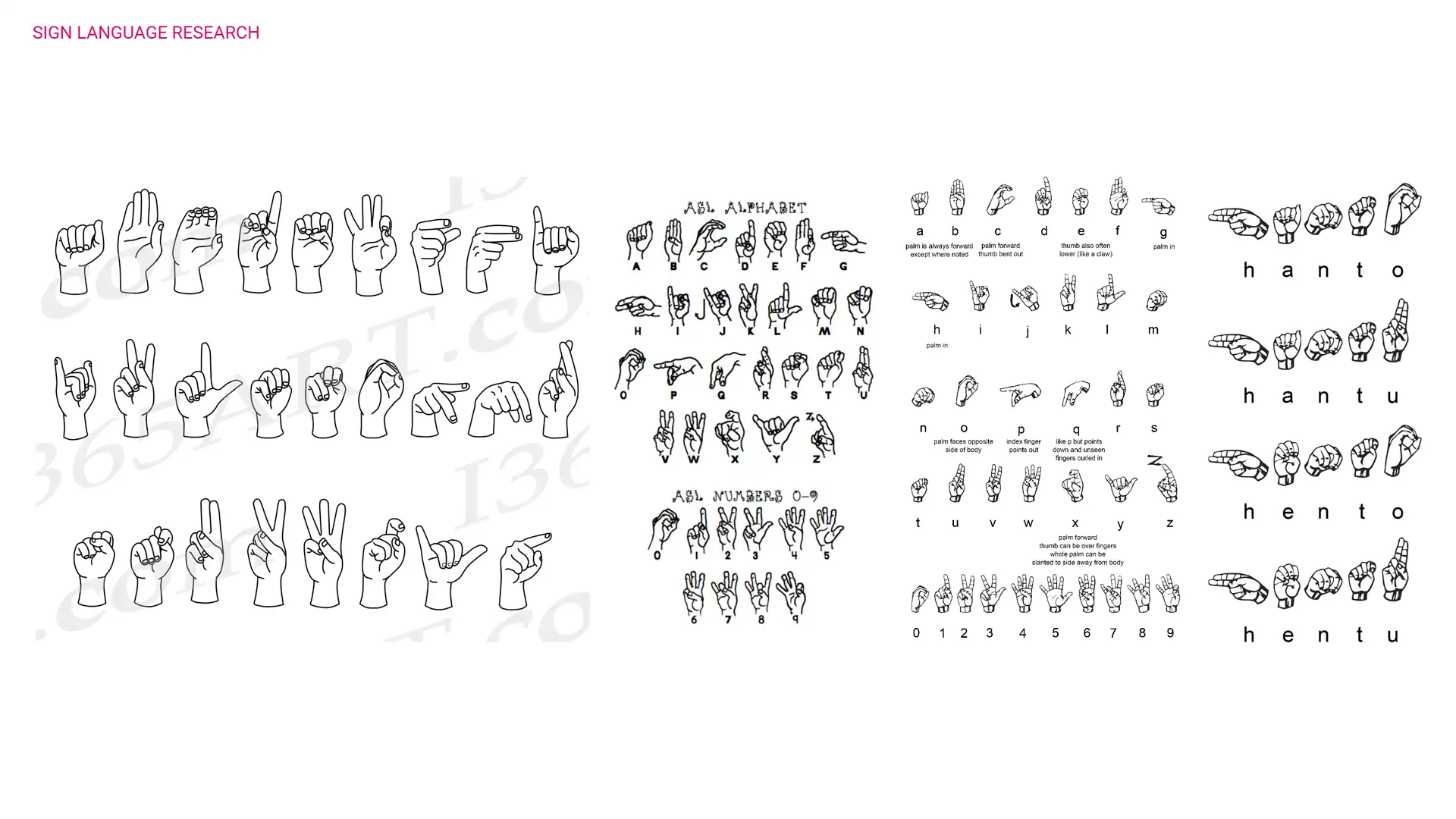
Since Hanto is all about sign language and using your
hands, it stands to reason that I would do some research
on sign language as well. As it turns out, there are
between 138 and 300 different sign languages across
the world. For that reason I decided to focus mainly
on American Sign Language for my project, with the idea
that you can switch between your sign language of choice
using your smartphone. Sign language is not just a direct
translation of the spoken language it corresponds with.
It is in essence its very own language, which means that
some people who were born deaf can’t even read written
language that well since it’s essentially a different language.
For this reason I played around with the idea of
having an interpretor sign the text that’s in the animation,
but I eventually decided to go against it as it would
distract from the animation itself and in essence the
animation combined with key words should visually
explain what the purpose of Hanto is. In the final animation
I replicate the situation of someone ordering coffee.
I purposefully showcase the grammar in a way that makes
sense for American Sign Language as opposed to translating
it into spoken English since it would connect more with
a deaf person as this is what they are used to.
Contact with leap motion
Since my project is heavily based on the existence
of the Leap Motion Controller, I decided to get in contact
with the creators to see what my physical limitations
were for the actual device itself. I didn’t want to end
up creating a device that could not exist in the real
world. When asked about the possibility of a machine reading
sign language, they said that sign is incredibly complex
similar to speech. However, it is not impossible:
“people adapt their speech to make it more readily
understood by machines so it’s possible those who use sign
language might sign more clearly in a standardized
fashion to help machines speak for them.”
This sentiment is in line with the idea that people
in VR Chat use a simplistic version of sign language to
communicate already and as shown in my earlier research,
there is already AI technology being used to learn to read
sign language correctly similar to how we can talk to
our smartphones. At this stage, Hanto was still considered
to only work with smart glasses, so we discussed the
possibility of sending all the data it receives from reading
sign language to your smart glasses over Bluetooth so
that it could process it.
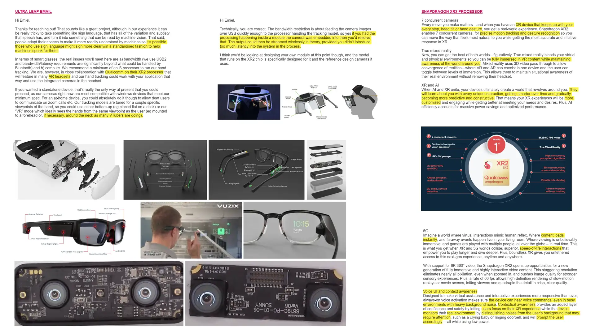
As it turns out, that would not work: “In terms
of smart glasses, the real issues you’ll meet here are
a) bandwidth (we use USB2 and bandwidth/latency
requirements are significantly beyond what could be
handled by Bluetooth) and b) compute. We recommend
a minimum of an i3 processor to run our hand tracking.”
They mentioned that they were in collaboration with
Qualcomm and their XR2 processor that they will feature
in many of their AR headsets. Since the processors
are incredibly small since they can fit inside smart
glasses, I proposed the idea of computing all the data
directly inside of Hanto itself and then sending the processed
data to the smart glasses over Bluetooth.
This would essentially bypass the issue since it’s
no longer sending raw data: “if you had the processing
happening inside a module the camera was embedded into
then you’d resolve that. The output could then be streamed
wirelessly in theory, provided you didn’t introduce too
much latency into the system in the process.” As a final
note when talking about how you could most efficiently
wear it, he added: “if necessary, around the neck as many
‘V-Tubers’ are doing.” Essentially confirming the idea
I had to mount the device around the chest area for the most optimal tracking.
Research possible technology
Based on the conversation with the people from Leap
Motion, I looked into the Qualcomm XR2 processor to see
if it indeed could handle everything that I would need
for Hanto to work. This was a very vital step as it allowed
me to build a strong foundation for the project.
The XR2 works with 7 concurrent cameras, which means that
no matter what move you make, it keeps up with your
every step, head tilt and most importantly hand gesture.
It’s also ideal to have in the smart glasses that you
use together with Hanto as it allows for fully immersive
VR content while maintaining awareness of the world
around you, which is quite important when you’re out in
public. When combining the AI learning technology
mentioned before with the XR2, it is stated that they
will learn about you with every unique interaction,
getting smarter over time and learning specifically with
how you move. Ideal for sign language users since they
might perform certain gestures slightly different.
As the XR2 uses 5G technology, it allows for
instant content loads. This makes visual feedback when
paired with smart glasses instant and creates a
smooth conversation between 2 people without any delays.
What’s probably one of the most interesting
and perfect features of the XR2 is its ability to hear
voice commands, even in busy environments with heavy
background noise. The device can distinguish which noises
are background noises and which are coming from the
speaker so that it can focus on what the other person is
saying. It also is able to pick up on sounds that
might require immediate attention such as car horns,
a doorbell ringing or a crying baby. This makes this
technology perfect for deaf people and for Hanto.
../animation
Story boards
In order to present what Hanto is, I had to create
an animation. It was clear to me early on that I would
have to create a frame-by-frame animation to represent
Hanto the best. Since hands are such a vital part of the
brand identity, I wanted to create an animation that was
hand drawn and also looked that way. A 60 frame per second
animation made in after effects would look too digital
and lack personality. For that reason I decided to stick
to a 24 frame per second animation that is animated on
2’s, meaning I only draw 12 frames within those 24 frames.
This creates a visual style that looks like classic
Disney animations and really emphasizes the hand drawn
aspect. Now that I knew how I would animate it, it
was time to actually figure out what I would be animating.
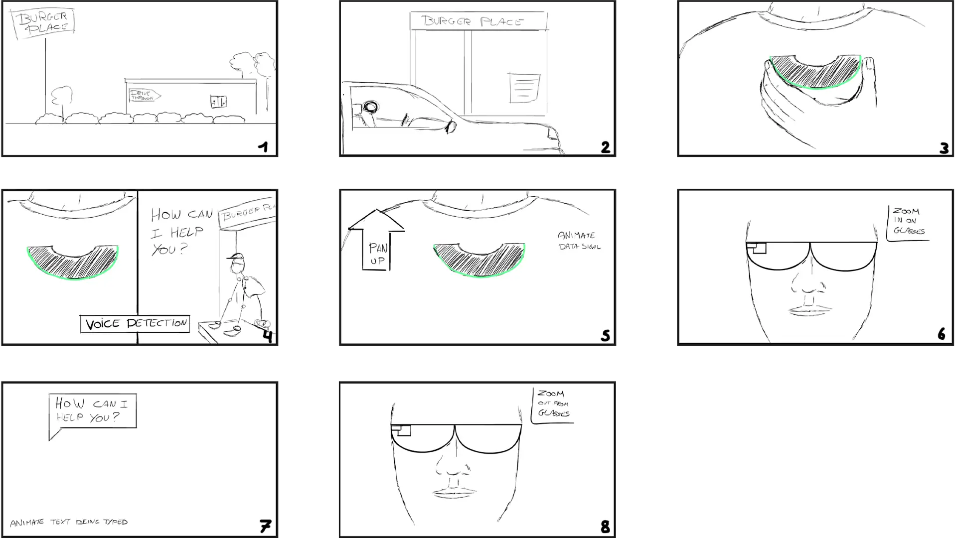
This meant creating story boards. Initially I came up
with a cinematic animation that would showcase a deaf
person ordering food at a Drive Thru similar to the
videos from Sign Duo. Only in the animation it shows how
Hanto allows for a smooth process. As it turns out,
the cinematic angle didn’t really work as it made it
took the focus away from explaining what the product
does and simply shifted the attention to the scene happening.
I decided to look up what other infomercial animations
do in order to get inspired. I realized soon enough that
the emphasis lies on smooth transitions from one step
to the next. The drawings themselves don’t have to be fancy,
but instead the flowing animation helps tie together
the idea of what the product does. With this new information
in mind, I went back to the drawing board.
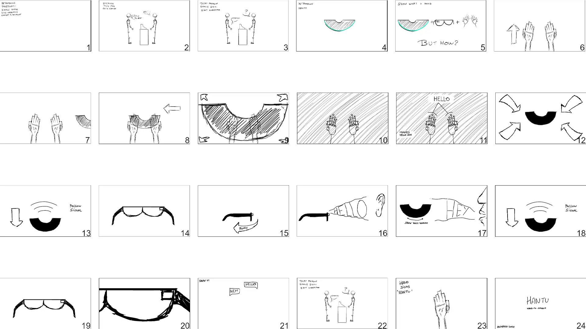
I decided that the scenario of ordering coffee had
to stay, as it is what inspired the project in the first
place and it pro vides a relatable moment that Hanto
provides a solution for. In this story board I heavily
focused on making one scene flow to the next in a fun
and logical way that explains the product. But I wasn’t quite happy with it yet.
I would however use parts of this story board into
the final animation. I decided to look at some more
animations, this time specifically on selling products.
This is when I stumbled upon the animation studio Jelly.
It became quite clear by watching their animations
that what I was lacking in my story board was more fun
and human elements. With this new information in mind
I developed the final story board. It was more focused
on how it made people using Hanto feel, as opposed to
simply explaining what it does.
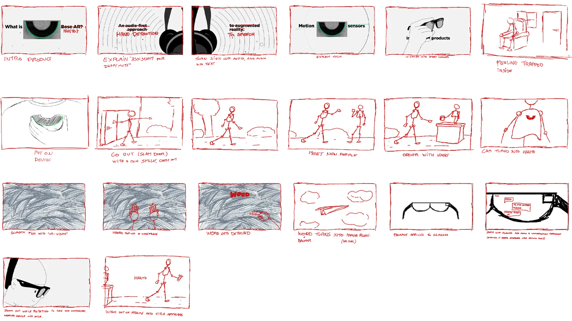
The final animation starts by simply showing Hanto
and asking the question “WHAT IS HANTO”, triggering
curiosity in the viewer. It then goes on to explain
how it is a communication assistant for the deaf and
mute, followed by explaining how it takes sign language
and turns it into speech. This is visually represented
by hands spelling out Hanto in ASL, followed by
someone speaking into a megaphone.
While I tried many variations, such as hands turning
into sound waves or turning into a megaphone, the best
choice for transitioning was simply a megaphone flying
into the hand that is already on screen. This causes less
confusion and gets the message across clearly.
To further the smooth transitioning the megaphone gets
thrown into the air, which reveals the phrase “and speech”.
The phrase then gets covered in letters to visually
represent its transformation into text. Since “and speech”
is already written in text technically, it was hard to
find a solution for a visual representation, but this one
felt like it naturally moved the scene along and got
the message across without being distracting. Hanto then
shows up on screen again, squashing the text and revealing
a new phrase “so how does it work?”. The chapter of briefly
explaining what the device does to peak interest using
symbolic animations is now over as the animation now enters
the instructional chapter.
I originally used sound waves, but I didn’t want
to confuse the viewer since I already used similar waves
to represent data being transferred later in the animation.
Since this visual is a standard for representing audio,
I felt it was best to stick with the final option instead.
The new text then pops out of the line similar to how
the other disappeared and explains us how it detects speech.
This is represented by a barista telling our character
that his coffee is coming right up, as the words fly into
Hanto itself. Since speech is just sound again,
I had the same issues with not using the same visual
representation of data being sent or copying the
previous animation. For that reason I decided to let the
text simply fly on screen so that people could read
it well and understand that the text is being heard by Hanto.
A hand grabs Hanto off the screen and the scene
transitions to a chest where our character places Hanto
onto his chest where the words “Mount magnetically”
are located. While I debated going further into detail
on showing the magnetic connection, it always felt
distracting as it wastes too much time on simply
explaining that it is magnetic, which is not what
makes Hanto special. The camera then zooms into Hanto
and the color of the scene changes as a visual
representation that we are now looking through the eyes of Hanto.
I initially showcased this by adding weird patterns in
the background but it was visually too distracting from
what is actually important in this scene. Since Hanto
is the only green element on screen, I felt like turning
the background green after zooming in got the message across just fine.
Two hands appear into the scene, but this time we
see a bone-like structure, similar to how the Leap motion
Controller shows its finger tracking. The hands perform
the signs for ordering coffee and we see a bubble detecting
the signs and interpreting them, telling us that Hanto
recognizes the signs. We then zoom back out of Hanto and
our character turns around, revealing how it turns sign
into speech. To represent this and add fun to the animation,
the text bounces up before disappearing into a line which
then serves as a visual for sound.
The camera turns back into frontal view as Hanto shoots
out data waves upwards, as it is revealed that Hanto can
relay all this data to a pair of smart glasses. We then
zoom into the glasses to reveal what that might look like.
This time I use the red color since I still want to
distinguish it visually from the other scenes. The scene
shows how Hanto reads the sign and relays it into text
like a text message, followed by it detecting speech and
doing the same.
This texting visual is easy to understand as the viewer
knows that bubbles on the right are the ones we send
while the ones on the left are from the people we talk
to. The animation then zooms out entirely and reveals
our character getting his coffee as he walks off screen,
revealing the name “Hanto”.
First draft
Eager to start my animation, I soon realized
that I should study a bit more on how to create solid
animations to begin with. I had already taken
courses from Motion Design School, an online learning
platform that teaches animation in both 2d and 3D.
However, I wanted to make sure I get all the basics right.
For that reason I looked at the famous “12 principles
of animation” by Frank Thomas and Ollie Johnston. These
principles basically explain how to make an animation
look more alive by adding things such as bounces and squashes.
You can see many of these principles applied in the
final animation.
Now that I was all set, it was time to start
animating. I created the first draft in Adobe Animate,
which is essentially a vector based drawing program.
This allows for easy correction and resizing of elements
when coming up with your animations. Since its main
focus is animation it is also incredibly well equipped
with all tools necessary to develop animations such
as an easy to navigate timeline, easily adjusted onion-
skinning and so on. There is however one drawback,
since its vector based it can’t use Photoshop brushes.
Seeing how I wanted Hanto to look hand drawn,
I really wanted to use brushes that looked like pencils.
For that reason I decided to animate the base animation
in Adobe Animate and then apply the detailed artwork later
in Adobe Photoshop
I developed my animation following my story board,
but it turns out that the way I was focusing on the human
aspect was too distracting from the explanation of
the product. On top of that it also combined very literal
explanations with symbolic animations and it became too
hard to understand.
With that in mind, I cut out some of the scenes that
were too distracting and divided the animation in 2 parts.
The first half uses symbolic animations to peak the
viewers interest, essentially being a sales pitch for
the audience. Once I’ve triggered their interest,
the animation turns into a proper step by step explanation
of how the product works while keeping it fun to look at.
This turned out to be ideal because it made the animation work as an advertisement while simultaneously
being a great explainer video on what the product is
all about. I even kept in the ordering coffee scenario,
but only as a background scenario to help explain the
functionality of the device, making it far less distracting.
Detailing
With the base animation finished in Adobe Animate,
it was time to add detailing. I exported the animation
as a video and placed that video in Adobe Photoshop
using their timeline function. This function essentially
turns Photoshop into a proper animation program, all
be it with less user friendliness compared to Adobe Animate.
To keep the animation looking consistent I decided
to only draw using the same brush at the same size with
smoothness turned to 100%. By doing this I could
easily trace my previous animation and turn it into a
fully fledged hand drawn animation.
While in theory this process is as simple
as tracing over your previous work, it turns out that
the process would be a lot harder than imagined. While
working on the animation I realized certain transitions
weren’t good enough yet, meaning I had to draw without
the ability to trace previous work. On top of that, it’s
really hard to add more frames in the middle of the animation
as the amount of layers you have to move quickly becomes
overwhelming. The detailing of the animation ended up
taking as long as drawing the first couple of drafts, but
in the end it was a success.
Coloring process
Now that I had my animation drawn out,
it was time to color everything. The coloring process
consisted of taking several layers with the same color,
grouping them and then applying a solid color layer on
top of it. For the coloring of the background and
coloring in elements like the hands, I had to use the
magic wand tool per frame inside the line work, expand
it by 3 frames and fill the selection with color. While
certainly an easy process, doing this for an animation
of 1 minute and 11 seconds quickly becomes a long process
of several hours. Especially since I changed color
schemes several times.
Audio process
With the animation drawn and colored,
it was time for the final touches. While the product is
aimed at deaf people, it doesn’t mean that hearing
people can’t become interested in the product as they
might have a deaf partner, relative or friend that
they could introduce Hanto to.
With that in mind, I decided
to add sound effects and music from a service called
“Soundstripe”. At first I wanted to use music that
most infomercials use. Something that’s uplifting but not
too intrusive. However, I felt like it didn’t quite match
the image of Hanto. While I was looking for potential
voice over actors on “Fiverr”, I came across an African
American voice actor who does some great “urban” sounding
work. In one of his examples I heard a really funky
tune and I realized that this was exactly what Hanto
needed to be. With this new information in mind, I went
to look for similar songs on Soundstripe and soon found
the perfect song for the animation. Not just because
it was funky, but it happened to perfectly match up with
most of the animation.
I imported the final animation into Premiere Pro where
I was able to add the sound effects, add the song and add
some extra frames where needed to the animation so that
all the text was readable and so that it flowed better
in general. Having done all that, all that was left
was exporting the video and the animation was finished.
../brand
Naming
As stated before, the idea behind the name Hanto
comes from the term “hand-to-speech” which is a play on
the existing term “text-to-speech”. I played around
with different versions of the name, even using the letter
U instead of an O to resemble the shape of the device.
I decided against it letter as Hanto seemed more inviting,
friendly and fun. I tried to keep the name within to
syllables so that it is easier to remember and more catchy.
Shape
The shape of Hanto was undecided for a long time,
going through many different shapes before I eventually
settled on the U shape. I played around with a lot of
futuristic shapes at first, but I soon realized that the
crazier the design of the device itself is, the more
attention it attracts in a way that is unwanted. Hanto is
meant to be an assistant for the deaf that they can
use from a casual setting all the way to important business
meetings. I didn’t want Hanto to distract people with
its weird shape so I decided to keep it simple.
Not only that, but the simple U shape also makes
it easier to wear on different types of clothing and makes
it less heavy due to its compact form factor. The U shape
actually is more than just easier to wear however. To keep
in line with the friendly and fun nature of the brand,
the U shape looks like a smile that literally lights up
when interacting with it. Combined with smart glasses
it even creates a technological face of a smiling mouth
and 2 eyes.
The way you wear Hanto is using a magnet,
similar to the strong magnets used to clean fish tanks
from the inside. The way to do this is simple, you hold
a thin U-shaped plate on the inside of your clothing in
the place where you want to wear Hanto, and then you
simply attach Hanto on the outside. The strong magnet will
attach itself through most fabrics as tested before with
a pair of fish tank magnets and allows for a versatile
experience. The use of magnets offers a symbolic meaning
as well. Magnets are essentially polar opposites that connect
with each other. Hanto does the same by connecting deaf
and hearing people in the form of communication.
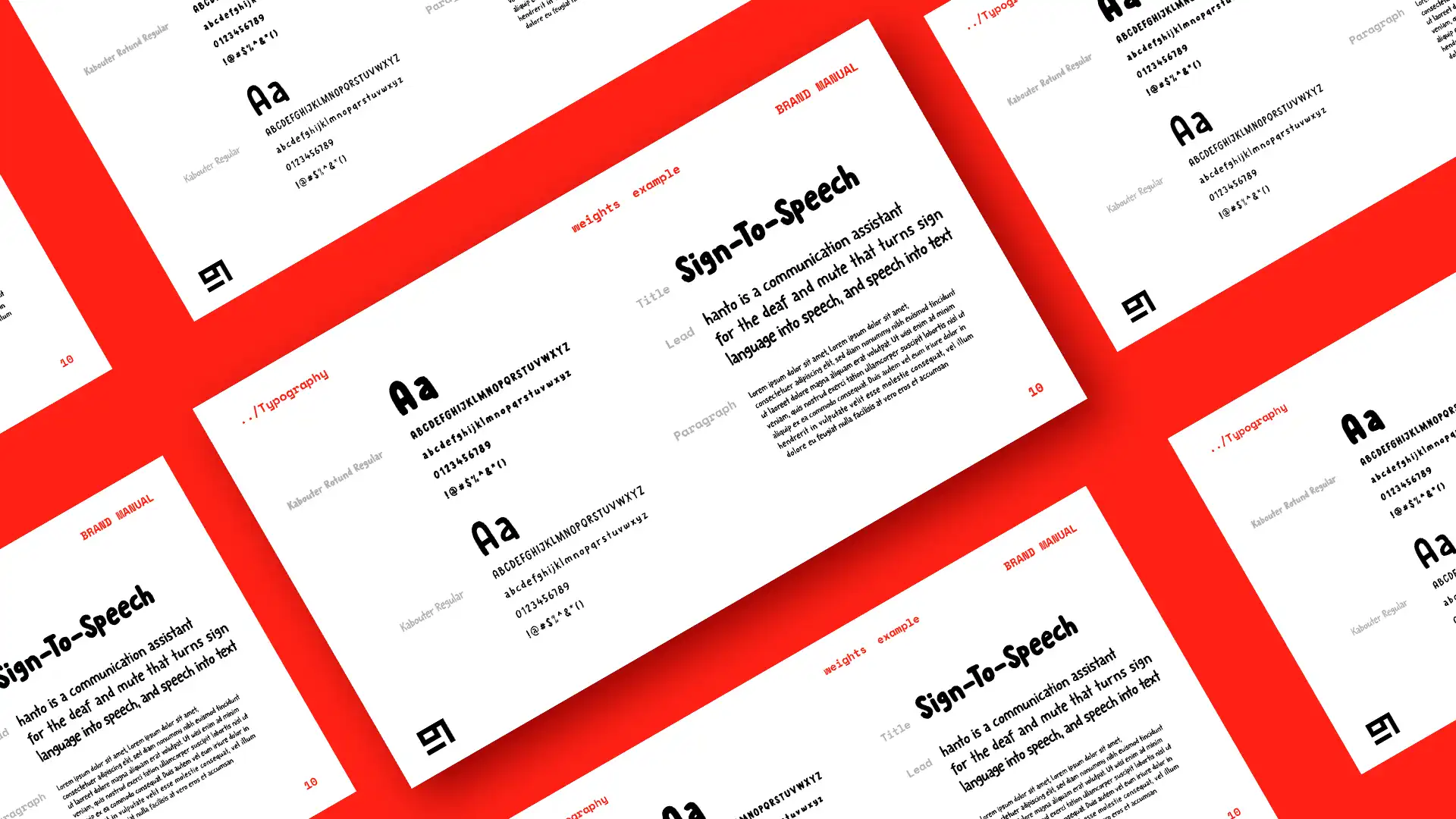
Font
For the font of the brand I wanted to keep in
style with the hand drawn style of the animation, but keep
it legible nonetheless. At first I tried manually drawing
characters but I soon realized it made the letters less
legible and it also blended in with the animation too much,
essentially making the text not stand out enough.
I looked around for fonts on the website “MyFonts”,
which is where I eventually found “Kabouter”. The reason
why this font stood out to me compared to others is
because it didn’t have too many distractions. It simply
fulfilled its purpose of looking like a hand drawn font
and that’s all it had to be since I wanted the main focus
to be the animation and not wacky letters.
The presentation of the font also fell in line
with my project as it’s presented alongside drawn
characters. I used the font not only as running text,
but also as the word mark for Hanto. From my experience
working in the packaging design business, a logo is
rarely the way to go as the brand revolves around a
product that will eventually be outdated.
A logo is much more fitting for the mother company
who created the product for example as that company
aims to exist for a long time, trying to bring many
products onto the market. I also didn’t want the logo
to take away from the style of the brand itself as
the unique style carries enough recognizability and
character without relying on a special word mark or logo.
Art style
For the art style I wanted it to resemble
an animation that was hand drawn on a piece of paper.
I looked around for brushes that would create this
grainy pencil look without being too boring or too extreme.
The brushes aren’t the only thing that I had
to keep in mind however. Many corporate animations and
websites these days feature similar generic vector
based characters. I wanted to steer away from that as
I really wanted to art style to be the highlight of
the brand. For that reason I went through several versions
of hands and characters, some more detailed than others,
before finally settling on the final art style. Its simple
enough that it doesn’t distract from the message while
holding enough unique elements such as the X-Ray hands
or the characters themselves. Most importantly, it relays
the fun aspect very well which is what I keep trying to
push in the brand identity.
Color
I went through a lot of color choices along
the way. I initially started out by searching for a color
that I wanted the light of Hanto to be. Since a lot of
other devices already use the color blue, I wanted to do
something else. I eventually stumbled upon this very
vibrant green which seemed to work well on various types
of clothing without it looking too science fiction or
too tacky. It was a nice middle ground that would become
the base of my color scheme.
Initially I paired the green color with a tint
of gray that allowed it to shine. Not just by being easier
to see on it compared to other colors, but also because
it was the only color in a see of gray. However, when doing
my research on other animations, I found out that this
color scheme was already in use for a pair of smart glasses
from Bose. Since Hanto is aimed at being paired with
smart glasses, it seemed unwise to have the same color
scheme and make use of an animation at the same time.
I abandoned the gray but stuck with the green
color as my base. I decided to place the green color into
the Adobe color wheel to see what options would work
best with the green that I already had. By doing this,
I found out that warm reddish tints work great as a
complementary color. As the base I went with a more subtle
tint, basically serving the same purpose as the gray
I used earlier, but this time in a warmer tone. For the
hands and characters I used a very deep color that
looks like red with a tint of orange.
By choosing these colors, I was able to allow
the green color to pop while also adding more character
and life to the animation. In fact, the red tints made
the whole brand a lot more inviting compared to the sterile
gray. While I played around with various shades of
red, the final color scheme is the one I eventually decided
upon since its warm, fun, friendly and inviting which
made it perfect for Hanto.
The colors I ended up choosing are not actually
the final colors of Hanto however. To create the deep
vibrant colors of Hanto, I added a paper texture on
top of the drawings to make it look more like a physical
drawing. I then turned that layer into a soft light
adjustment layer, allowing the texture to really shine
through while simultaneously creating the deep and
rich colors you see in the final result
../packaging
Naming
Every product needs good packaging. In order
to showcase the versatile nature of the brand, I decided
to create mock-ups of packaging. Having worked for
Snow Donuts, an award winning packaging design company,
for the past year, I had enough experience under my
belt to create the packaging for Hanto. Starting with
the form factor, I noticed in my earlier research that
a lot of devices are packaged in really boring boxes that
don’t elevate the brand or product in any way. To change
that I decided to go with a design that closes magnetically
similar to how Hanto uses a magnet. The design also
allows for more of a hand-on experience with the packaging
itself which strengthens the idea of using your hands.
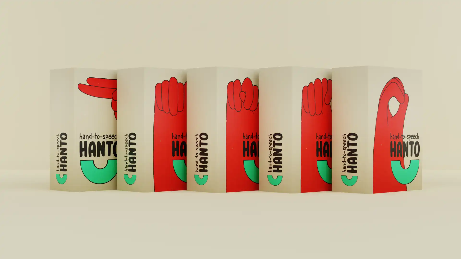
The facing of the box is a fun way to place
the boxes onto shelves. You always want to think about what
the packaging will look like in stores when designing
packaging and in this case I wanted the hand signs to spell
out Hanto so people who know sign can see it from a
distance. The first box, spelling the letter “H”, has the word
mark on the left instead of on the right. While this
might seem odd at first, it’s actually for a good reason.
Not only does it serve as a composition choice, but
also as a visual reminder that this is the beginning of
the word Hanto.
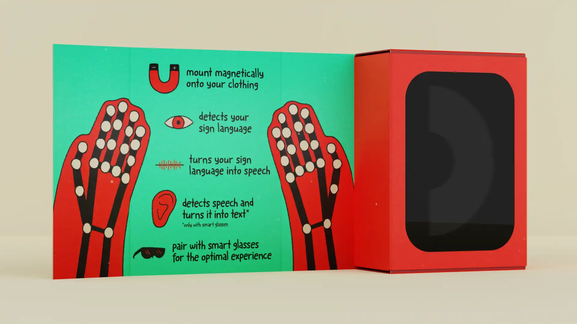
Due to the form factor of the box, I was able
to keep the outside of the box clean of most detailed
information. When people want to learn more, they can
open the box and they will find a visual resembling the
vision of Hanto with all the unique selling propositions
explaining what Hanto does exactly.
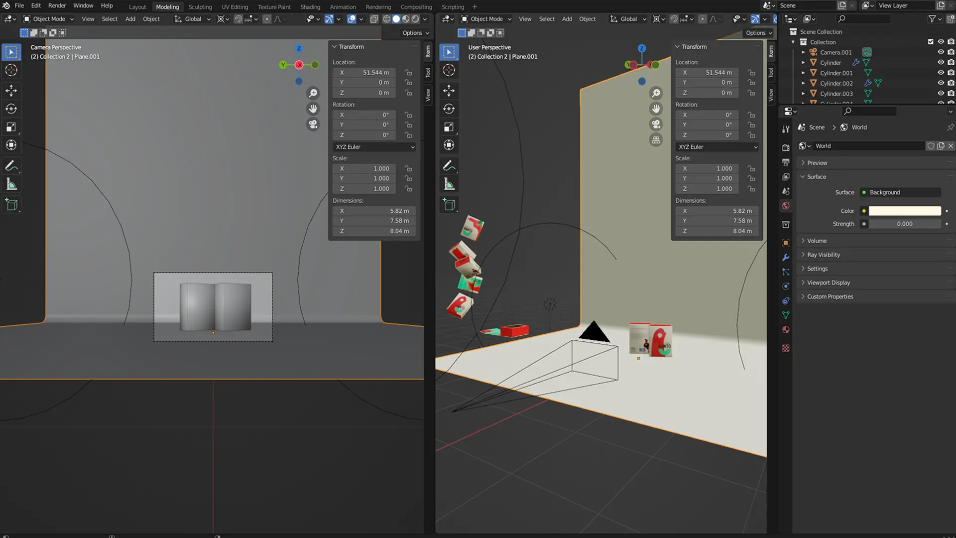
In order to create this packaging, I first designed
a dieline of the unwrapped packaging. I then designed
the packaging underneath said dieline and put it into
a 3d program called blender. Having placed the design
in blender, I’m able to cut all the folding lines and
fold the packaging just like you would in real life.
The benefit of this process is that the design
is already applied onto the box, you don’t have to design
a 3D box first and then UV-unwrap it to place a texture
on top of it which saves a lot of time and effort. Once
the 3d models were created, I created a virtual photo
studio where I could place lights and cameras to my liking
and create the final pack shots.
../website
For the mock-up of the web page I wanted
to essentially take the viewer through a simplified version
of the animation by telling them the story with visual
queues before landing on the purchase option. The web page
was created in Photoshop using elements from my animation
and pack shots I took in blender from my packaging.
I then turned it into an animation by bringing
in the animation I had already created. This creates the
effect of a video playing on the web page. To present
it in a nice way, I brought a 3d model of an iMac into
the same blender photo studio that I created and took
a photo of it, maintaining the visual style of the rest
of the brand. I then took that image into After Effects
and placed my animated website inside, creating the final
result of an animated mock-up.
../conclusion
With Hanto, the aim was always to first and foremost
solve the issue that I witnessed in that YouTube video a
long time ago. Helping deaf and mute people overcome
struggles that the average person never has to deal with.
Combining my passion for this struggle, the world of
virtual reality, branding and packaging design sparked
what would eventually become Hanto. A device that is
not only a communication assistant to the deaf and mute,
but also a gateway to a whole new world. A world where
people can have fun exploring the world and meeting new
people without worrying about the struggle of not being
able to communicate. I believe the final brand identity
of Hanto is a perfect visual representation of this idea.
Based on the research done, Hanto can become a real
life-changing device that could change millions of
lives, not just of the people who are deaf or mute, but
also of those around them.
